


Popster
The popcorn is one of the most popular, accessible and easy to make snacks. However, Popster believes that it has more potential that it seems. This brand of gourmet popcorn gave us the challenge to make an ordinary product turn extraordinary.
Solution:
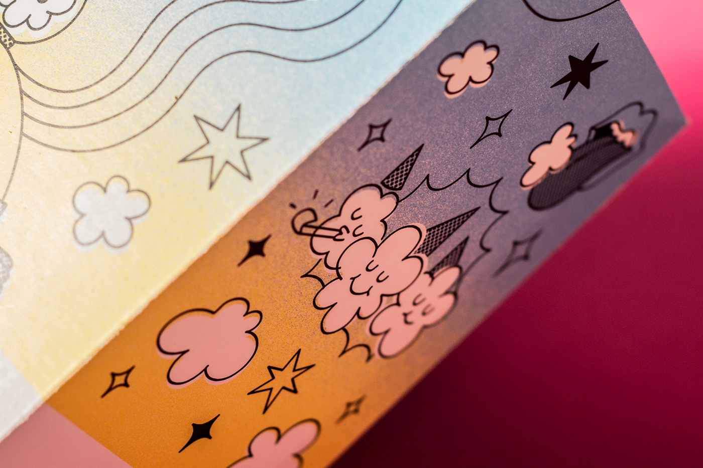
Worldwide, most of the popcorn brands keep a tradicional design and use visual codes like the use of stripes and the colors red and white, associated with the fair and the circus. Furthermore, we noticed that the category of gourmet popcorn is known for a clean and minimal design.
We needed to keep these traditional codes aside and break with the minimal approach of the gourmet popcorn category without achieving an over detailed packaging design. That’s how Popster was born, a name that makes reference to the love for pop culture cinema and the characteristic sound of the corn exploding (pop). The brand design is based on the creation of a universe with a main character. A space traveler that seeks for galaxies of extraordinary flavors.
Popster is an illustrated, fresh and colorful project that reflects the fun of popcorn and the animated fantasy of pop culture. The graphic system is constructed based in a color gradation, supporting graphics related to the concept of this new universe and solid color blocks that bring contrast and order to the composition. This brings as a result a fun project without living behind the premium character of the brand.


STUDIO: FIBRA BRANDING
IG: @fibra_branding
CREATIVE & ART DIRECTION: Andrea Gálvez
ILLUSTRATION : Ricardo Bustamante
GRAPHIC DESIGN: Ricardo Bustamante
ART DIRECTION PHOTOGRAPHY : Andrea Gálvez / Daniela Barrio de Mendoza
PHOTOGRAPHY: Daniela Barrio de Mendoza


